Project Overview & Timeline
Our team of three was challenged to design and integrate a new delivery and grocery list feature into the current Freshly Chopped app. By reading the client brief and conducting our own research, my team and I had 3 weeks to complete this project.
1. Empathizing With The User
Our team decided to begin our process by conducting primary research. We prepared a semi-structured interview, and got the chance to speak with 6 individuals in a week. We searched for participants who have had prior experience ordering food through mobile apps, participants who have used meal kits, and participants who grocery shop in person.
All interviews were conducted remotely, and compiled on a shared Google docs file.
Competitive Analyses
Freshly Chopped identified their biggest competitors to be Instacart and Doordash, two very popular food delivery services. My team and I also chose to analyze other competing companies, such as Good Food, Fresh ‘n Lean, One Potato and Blue Apron to get a more thorough understanding of the market.
Competitor User Interface Analysis


We noticed our biggest competitors utilized a great amount of categorization. This allows the user to narrow their search, feel guided and supported, and personalize the experience.
We particularly liked Instacart’s design approach. The quick add buttons and minimal layout makes the experience very intuitive and easy to navigate. After analyzing all our competitors, it became clear that Instacart was a direct competitor for Freshly Chopped.
Freshly Chopped Persona
Although Freshly Chopped had included two primary personas in their client brief, my team and I decided that they were not the best representatives for Freshly Chopped’s new feature. We chose to create a new primary persona based off the research we had conducted.
We realized that our persona must be someone who would increase business retention, and want to get their groceries delivered, in addition to finding new recipes. My team and I worked on creating a new persona who embodies what we called “The Busy and Ambitious Home Cook” archetype.
New Primary Persona
Empathy & Journey Mapping
After finalizing our persona, we wanted to put ourselves in their shoes to better understand what their needs and pain points may be.
2. Define
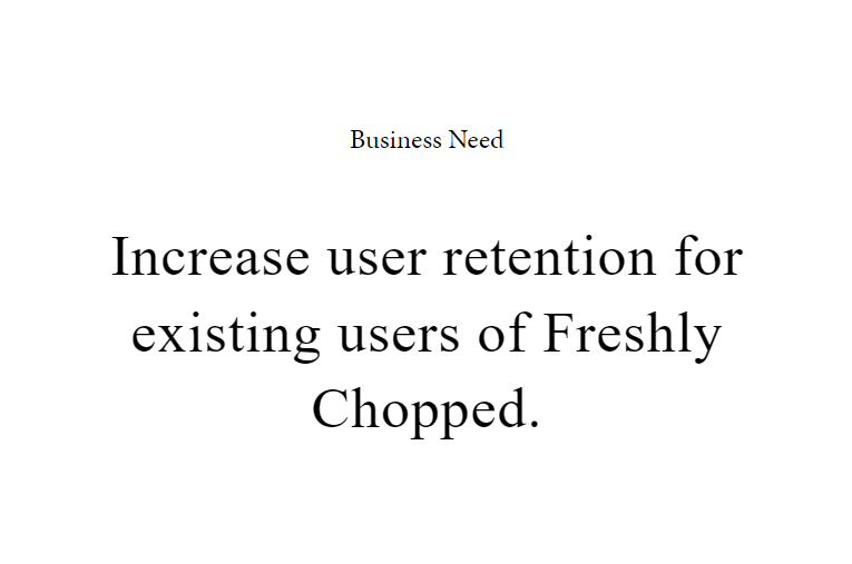
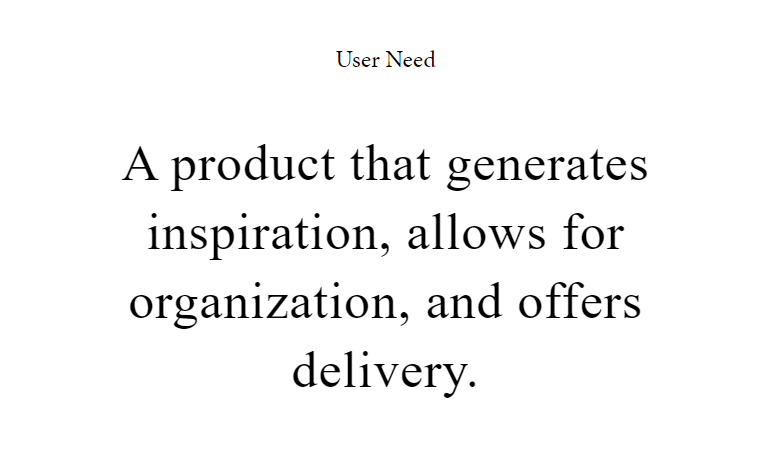
We had two things to consider; the business and the user. Both had needs to fulfill, therefore it became very important to make sure we could find a way to satisfy both ends.
HMW & Problem Statements
Problem
Freshly Chopped users who wish to generate an ingredients list for healthy new recipes are unable to do so through the current app, which creates added stress and poor time management.
HMW
How might we help busy, health-conscious home cooks generate a well organized ingredients list for new recipes, in order to reduce time consumption and alleviate stress?
Problem
Freshly Chopped users who wish to acquire specific ingredients for healthy new recipes found on the app, struggle to do so in an easy and timely manner.
HMW
How might we help busy, health-conscious home cooks obtain their fresh ingredients in a timely manner, in order to make them feel confident and motivated in the kitchen?
3. Ideate
At this point of the project, my team and I discovered that it may be useful and worthwhile to create a storyboard. We found ourselves stuck on where to begin, so we created a scenario to allow us to design for a specific/realistic problem in context.
4. Prototype
We began creating sketches and low-fidelity wireframes of all our ideas. We experimented with different ways to introduce the delivery feature. As the sketches developed, we realized that including the delivery option on the bottom menu tab was not the best idea.
Even despite being very visible and accessible, it was counter-intuitive to include the feature here because users would still have to then choose where to order their ingredients from. The delivery option should be the last step in the process. We then decided to try and integrate the grocery list feature in the bottom menu, which is useful for users who will utilize the delivery feature, but also to those who will not.
Considering we already had an established homepage and overall app layout, we were looking for ways to include these new features in the most natural, seamless way possible.
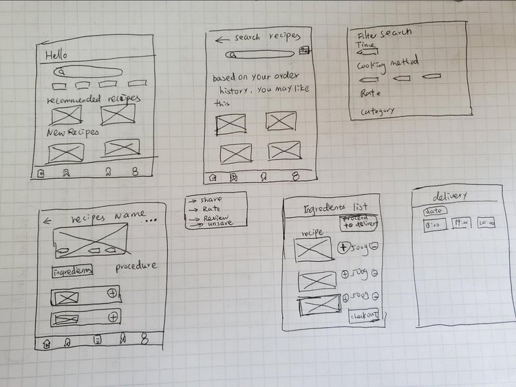

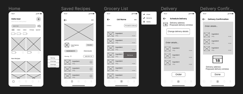
We finalized our creative direction and wireframes for user testing. Each team member tested two participants and collected feedback.
Results From User Testing
Include ‘chat’ or contact option at order confirmation stage for potential user questions, feedback and frustrations.
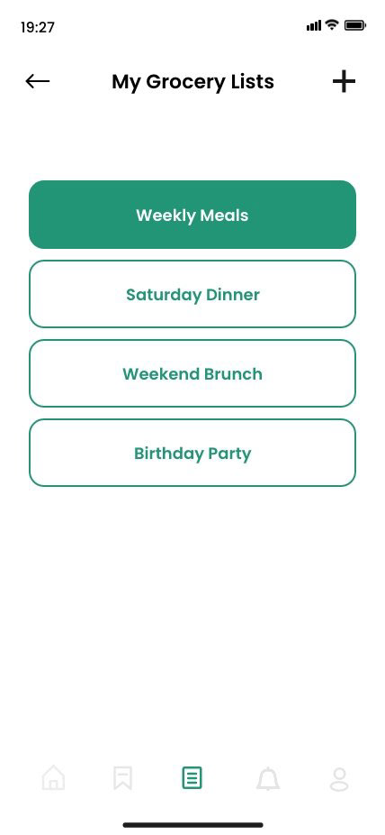
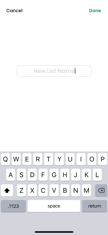
Add ability to create multiple grocery lists.
Prioritize recipe recommendations.
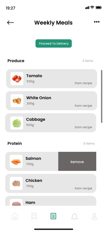
Categorize ingredients based on product type (produce, meat, etc.)
Add function to view upcoming order.
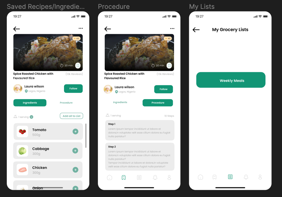
UI Design
The branding for Freshly Chopped had already been established by the client. I gathered the colours, iconography, font and logo in one document to help my team and I stay true to the client’s pre-established brand.
5. Test
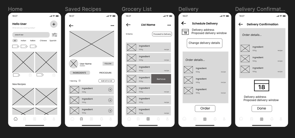
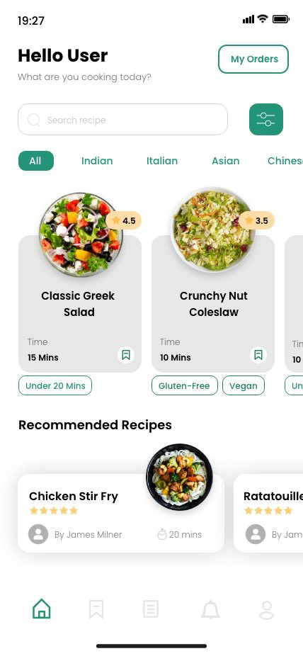
Final Medium-Fidelity Wireframes



What Did We Do?
Added tab at the bottom menu for grocery list.
Relocated “plus” button to profile page.
Added Tag features from filter search.
Removed double profile icon and replaced with “My Orders” button.
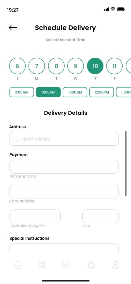
For delivery, users can select a date and time for their convenience.
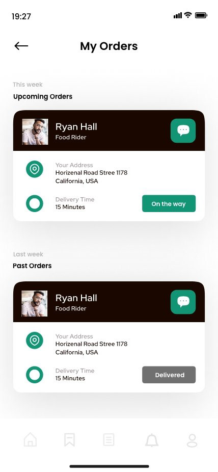
To view upcoming and past orders, users can click on the “my orders” button on the homepage.
Added quick add buttons for each ingredient.
Added “add all” button for even quicker process.
Users can change serving size, which will change portions accordingly.
Designed the main bookmark screen, where recipes are categorized.
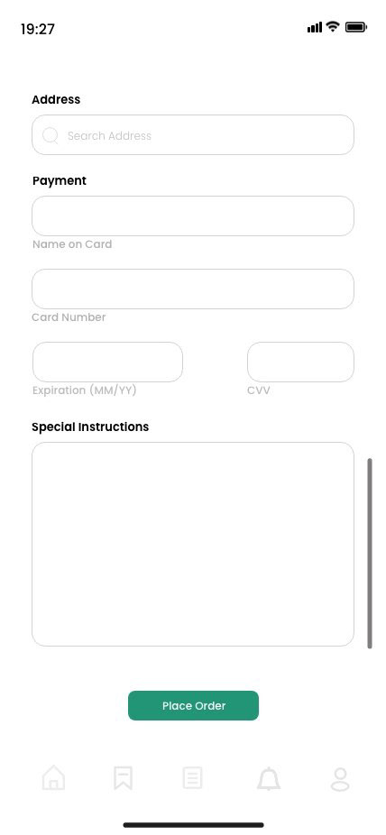
Quick information and payment process.
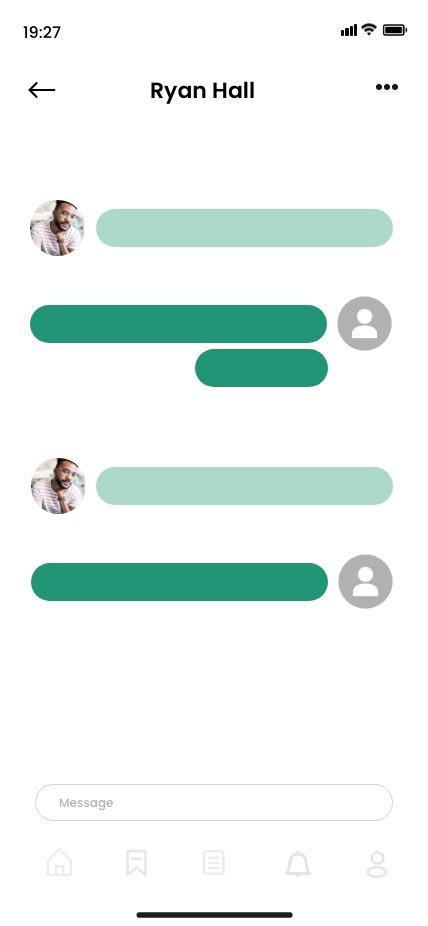
Users can see progress on their upcoming deliveries and message delivery person for updates/concerns.
Users can select which grocery list to add ingredients to.
Grocery lists are categorized by food type, allowing easier shopping experience for users who wish to go in person.
Individual ingredients may be removed by swiping, or users can delete entire list.
Users may also share list with friends and family.
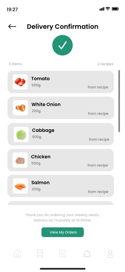
An order confirmation with all the ingredients is shown. Each ingredient indicates which recipe it comes from to allow users to not make the mistake of duplicating.
Outcome of Proposed Solutions
Retention
Anticipated weekly order rate, based on user’s current grocery shopping habits.
Re-engagement
Daily engagement is promoted through list function, based on user’s current habits.
Positive ROI
Integration of new features into existing app and functionalities to create an intuitive user experience.
SEO Boost
Restructured and more varied categorizations to enhance SEO.
App is no longer just a search engine for healthy recipes, but also a personalized experience that caters to its user’s needs, ultimately allowing the business to grow and see positive return.